How to Build a Cohesive Junk Journal Kit: From Mood Board to Etsy Listing
By Ephemera Crafts Atelier
•
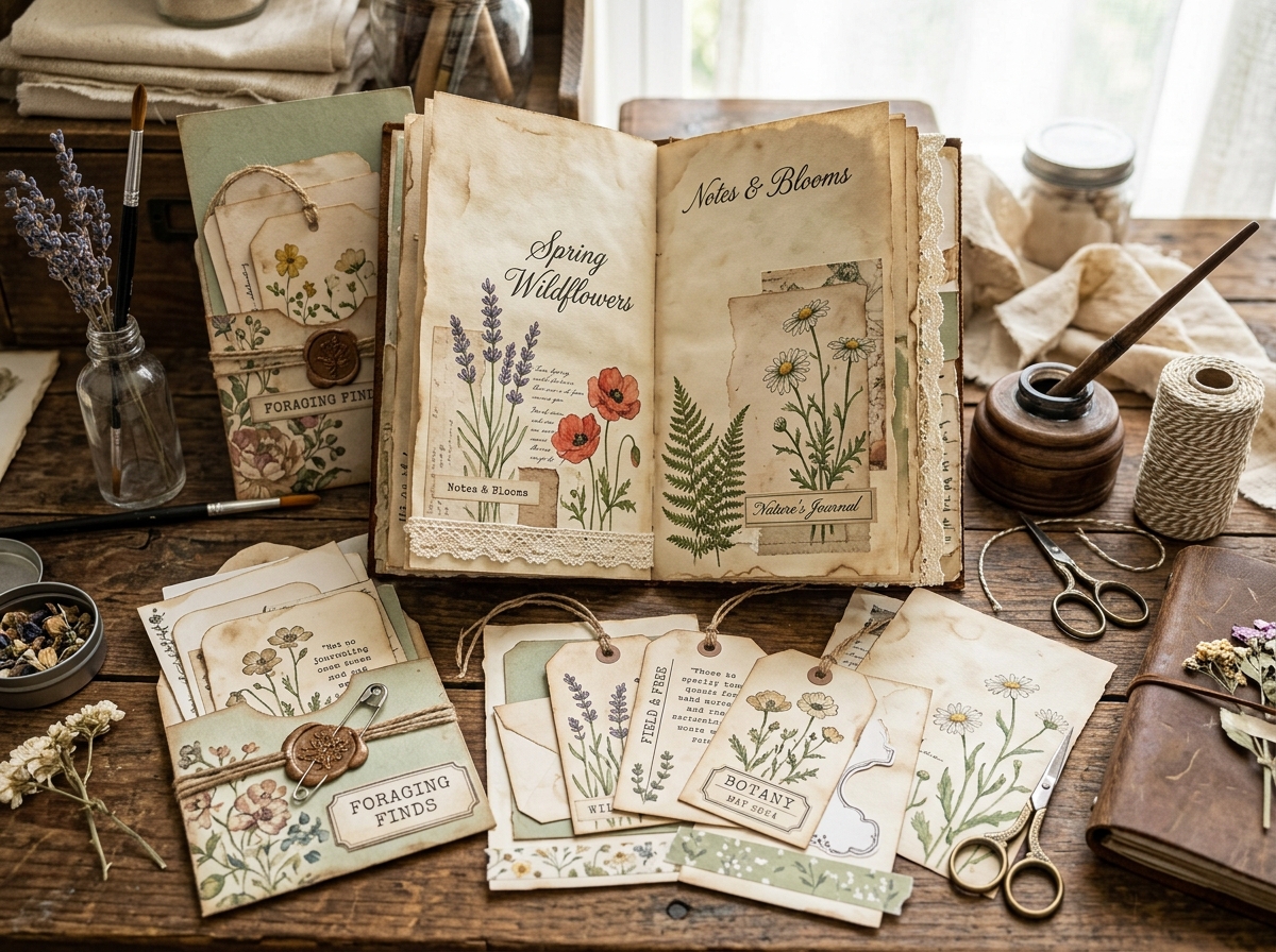
Cohesion is not a filter applied at the end — it is a decision made at the beginning and protected through every step.
Every digital paper seller eventually faces the same moment: a folder full of beautiful pages that do not quite make a collection. Each sheet is fine on its own, yet the set refuses to feel like a set. The fix is rarely more design talent — it is a process. This is the one we use in the studio, from the first mood board to the listing copy.
## Step 1 — Write a one-sentence collection brief
Before choosing a single colour, write one sentence that describes the collection as if it already exists. For example: *"A muted autumn collection for junk journalers who love aged ledgers, faded botanicals and rust-coloured accents."* That sentence now has veto power. Every paper, tag and pocket must pass it. If an element needs a paragraph of explanation to fit the brief, it belongs in a different collection.
A good brief contains four things: the season or era, the mood, two or three visual references, and the person it is for. Vague briefs produce vague sets; specific briefs make decisions fast.
## Step 2 — Lock the palette before you design anything
Choose three to five core colours plus two neutrals, and make swatches you can hold against every new element. A practical balance for paper collections is roughly 70% base tones (creams, parchment, soft greys), 20% supporting colours (olive, dusty rose, slate blue) and 10% accent (rust, oxblood, antique gold). The exact ratio matters less than the discipline: nothing enters the collection that is not on the swatch card.
This is where most "almost cohesive" sets fail — not because the colours clash loudly, but because each new page adds one more tone until the palette has quietly doubled.
## Step 3 — Choose three or four texture families
Cohesion needs variety, and variety needs categories. Most strong paper collections draw from three or four texture families:
* **Aged documents** — ledgers, graph paper, stamped forms, legal paper;
* **Natural history** — botanical plates, insect studies, shells, feathers;
* **Typography and postal** — letters, postmarks, script, tickets;
* **Quiet solids** — plain toned paper, subtle mottles, tea-stained sheets.
Repeat the same families across every element type: if your backgrounds include botanical plates, your tags should include botanical details too. That repetition — not identical imagery — is what produces collection-wide visual consistency.
## Step 4 — Pick two or three signature motifs
A signature motif is a small visual idea that reappears at different scales: a moth, a fern frond, a postal mark, a particular label shape. Use it large on a background page, medium on a journal card, small on a tag, and as a single accent on a pocket. Buyers will not consciously catalogue the repetitions, but they will feel the set "belong together". This is the cheapest cohesion trick in design and the most effective.
> **Studio habit:** Keep a one-page collection sheet: brief, palette swatches, texture families, signature motifs, and the full element list. Every new piece gets checked against that page — not against your memory.
## Step 5 — Define the element list (and the numbers)
Decide the exact composition before designing, because the numbers become your listing copy and your quality control. A typical full kit might include:
* 12–18 background papers (a mix of the texture families);
* 4–8 journal cards or title cards;
* 6–10 tags and labels;
* 3–5 pockets, tuck spots or envelope folios;
* 1–2 sheets of fussy cuts;
* 1 cover or signature wrap.
These are example proportions, not rules — a mini kit can be four pages and three tags, as long as every element shares the same visual system. What matters is that the "what's included" list matches the files exactly. A mismatch between promise and download is the fastest way to earn a refund request and a bad review.
## Step 6 — Print a sample before you list
Screens lie. Colours that look muted on a monitor can turn vivid on matte paper; delicate motifs that read well at 100% can vanish in a thumbnail; two papers that seem to match on screen can reveal different undertones in print. Print at least one full spread, assemble a single page, and photograph it. This test costs a few sheets and catches the majority of cohesion problems before they reach a customer.
## Step 7 — Name the collection and its items
Use the vocabulary precisely: it is a **cohesive collection** made of **coordinating papers** and **matching ephemera**, sold as a **coordinated junk journal kit**. Names work best when they combine an evocative phrase with a searchable descriptor: "Autumn Ledger — a cohesive collection of aged papers and botanical ephemera". The collection name can be poetic; the item names should follow one pattern so buyers can recognise siblings in search results.
For the listing title itself, follow the formula in our [Etsy title guide](/blog/etsy-listing-titles-junk-journal/) — product first, theme second, contents and specs after.
## Step 8 — Structure the offer
You have three common shapes, and all can coexist:
* **Full kit** — the complete coordinated set, the best value and the clearest expression of cohesion;
* **Individual element packs** — papers only, ephemera only — for buyers who already own part of the system;
* **Bundle** — several collections packaged together for range; be careful with the word "cohesive" here, since a bundle of different collections is convenient, not necessarily unified.
Cross-link the listings to each other and mention the collection name in every description. Buyers who find one piece should be able to discover the family.
## The final check
1. **Brief test:** can every element be justified by the one-sentence brief?
2. **Squint test:** does the full set read as one palette and mood?
3. **Thumbnail test:** does a grid of small previews still look unified?
4. **Swap test:** does an item from another collection stick out immediately?
5. **Print test:** does the assembled page look as good on paper as on screen?
If all five pass, you do not need to call the collection cohesive — the buyer will do it for you. And that is the whole point of the vocabulary: it should describe the work, not decorate it.
---
*Related: <a href="/blog/cohesive-collection-vocabulary/">the vocabulary of cohesive collections</a> · <a href="/blog/etsy-listing-titles-junk-journal/">writing Etsy titles</a> · <a href="/blog/etsy-glossary-digital-paper/">Etsy glossary for digital paper sellers</a>.*