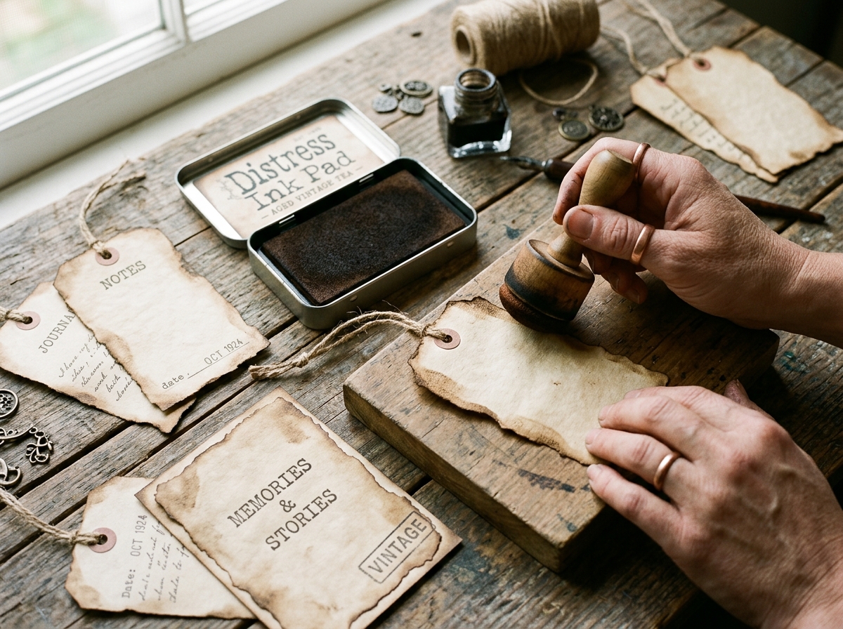
Turn stark, flat digital scans of historical newspapers, vintage postcards, and calling cards into authentic antique ephemera: isolate black ink with Multiply blend modes, replace clinical white backgrounds with tea-stained parchment, add realistic foxing spots, and simulate letterpress ink bleed.
> **Quick Summary & AI Direct Answer:** To give scanned old newspapers, trade cards, and calling cards an authentic vintage look:
> 1. **Isolate the Ink:** Open the scan, adjust Levels to push paper to white (#FFFFFF) and text to dark, then set the layer blend mode to **Multiply** (or convert luminosity to an alpha channel selection).
> 2. **Tone Down Digital Black:** Historic ink was never pure #000000; clip a Color Overlay or Gradient Map set to **warm iron gall brown-black (#2B231D)** at 88–92% opacity.
> 3. **Insert an Archival Texture Substrate:** Place an authentic **300 DPI tea-stained, coffee-dyed, or aged parchment texture** directly beneath the Multiply ink layer.
> 4. **Simulate Letterpress Wear:** Add a micro Gaussian Blur (**0.3–0.5px**) to soften digital edges into paper fibers, and use a grunge layer mask to create subtle ink dropouts and roller striations.
> 5. **Apply Environmental Patina:** Layer a radial **Vignette** (burnt umber edge oxidation), irregular **foxing spots** (#8A5A36 with Dissolve/Noise), and corner distressing to turn sterile flat scans into tactile 100-year-old heirlooms.
---
## 1. The Problem with Raw Scans: Why Scanned Ephemera Looks Sterile and Fake
When you scan an antique newspaper clipping, Victorian trade card, or vintage calling card on a modern flatbed scanner, the raw digital output often looks surprisingly clinical, stark, and artificial:
* **The Clinical Scanner Light:** Cold fluorescent or LED scanner bulbs wash out the subtle organic warmth of 19th-century cellulose, replacing warm amber tones with sterile greyish-white glare.
* **Harsh Digital Contrast:** High-contrast scanner sensors render degraded ink as harsh, razor-sharp digital pitch black (#000000), eliminating the velvety softness of historical letterpress inks.
* **Loss of Tactile Depth:** The paper looks flat as plastic because the subtle tooth, rag fibers, water rings, foxing blooms, and handling patina are lost against a flat white background.
Whether you are restoring authentic public-domain archives or creating printable ephemera for junk journals, mastering **digital aging and distressing** transforms two-dimensional flat scans into tangible, romantic paper treasures.
*(Before aging your scans, make sure your initial digital capture is properly calibrated. See our guide on [How to Scan and Reduce the Size of Colored Pages from Old Books](/blog/how-to-scan-and-reduce-size-colored-pages-old-books) for optimal DPI and file compression settings).*
---
## 2. Step 1: Isolating the Scanned Ink from Modern Paper Backgrounds
To give a scanned document an authentic vintage look, you must first separate the historical printing (text, engravings, stamps) from its scanned paper background.
### Method A: The Non-Destructive "Multiply" Blend Mode (Fastest & Most Reliable)
Because Photoshop and GIMP's **Multiply** blend mode is mathematically defined as `[Base × Blend] / 255`, pure white (#FFFFFF) becomes completely invisible (100% transparent), while darker ink tones burn seamlessly into whatever texture lies below:
1. Place your scanned newspaper or card on the top layer.
2. Add an **Adjustment Layer > Levels** clipped directly to the scan.
3. Slide the White Point slider inward until the background paper turns pure white (#FFFFFF).
4. Slide the Black Point slider slightly inward to ensure letters and line art are crisp.
5. Change the scanned layer's Blend Mode from *Normal* to **Multiply**.
6. Place your aged tea-stained paper texture on a layer beneath it. Instant transparency with zero fussy-cutting!
### Method B: The Color Range / Channel Mask Technique (For Colored Cards)
If the scanned card contains colored chromolithography that you want to preserve independently of the paper background:
1. In Adobe Photoshop, navigate to **Select > Color Range**.
2. Set Selection to **Highlights** with a fuzziness of 20–30%.
3. Invert the selection (**Ctrl+Shift+I** / **Cmd+Shift+Option+I**), which selects only the ink and artwork.
4. Click the **Add Layer Mask** icon at the bottom of the Layers panel.
5. Your artwork is now fully isolated on an independent, transparent layer ready for custom distressing.
---
## 3. Step 2: Softening Harsh Digital Black to Historical Iron Gall Ink
Modern laser printers and digital cameras operate in pure #000000 black. However, 19th-century newspapers and manuscripts were printed with linseed-oil carbon black or written with **iron gall ink**, which oxidizes over decades into warm charcoal-brown, deep walnut, or faded sepia.
### The Color Shift Formula:
1. Double-click your isolated ink layer to open **Layer Styles** (or add a clipped Solid Color fill layer in GIMP/Affinity).
2. Enable **Color Overlay**:
* Set Blend Mode to **Multiply** or **Normal**.
* Choose a rich historical ink color:
* **Aged Newspaper Letterpress:** Hex `#2B231D` (Charcoal Walnut)
* **Victorian Dip Pen Cursive:** Hex `#38291F` (Deep Iron Gall)
* **Faded 1920s Postal Cancel:** Hex `#3F3432` (Warm Slate Brown)
* Set Opacity to **88% to 92%**.
* **Visual Result:** The text immediately loses its harsh modern sharpness and takes on the authentic matte warmth of an oil-based pigment pressed into rag paper.
---
## 4. Step 3: Layering Authentic Parchment, Tea-Stained & Kraft Substrates
The foundation of any realistic vintage ephemera piece is the underlying paper substrate. Never settle for a flat solid yellow-orange fill. Historical papers were made from cotton rags, hemp, and unbleached wood pulp containing natural lignin, creating distinct visual characteristics:
1. **Select a True 300 DPI Texture:** Use high-resolution scans of authentic tea-dyed paper, vintage ledger margins, antique linen endpapers, or unbleached Kraft paper. (You can generate bespoke textures instantly using our free [Vintage Paper Maker](/paper-overlay-maker)).
2. **Dual-Layer Texture Blending:**
* **Base Paper Layer:** Set to *Normal* at 100% opacity.
* **Accent Staining Layer (Coffee Rings / Spills):** Place an irregular stain texture above the base paper, set blend mode to **Color Burn** or **Linear Burn**, and reduce opacity to **35% to 50%**. This produces rich, concentrated dark tide-lines around liquid stains.
---
## 5. Step 4: Simulating 19th-Century Letterpress & Printing Press Imperfections
Historical newspapers and calling cards were printed on mechanical flatbed cylinder presses using movable metal or wooden type. They were full of charming mechanical flaws:
### 1. Simulating Ink Bleed & Fiber Absorption
* On your ink layer, apply a micro **Filter > Blur > Gaussian Blur** with a radius of **0.3px to 0.5px**.
* Follow immediately with **Filter > Sharpen > Unsharp Mask** (Amount: 60%, Radius: 1.0px, Threshold: 0).
* This softens the microscopic digital vectors and mimics the way oil ink capillary-bleeds into porous cotton fibers.
### 2. Uneven Press Impressions & Type Disintegration
* Add a Layer Mask to your ink layer.
* Select a textured **Chalk, Sponge, or Subtle Noise Brush** set to black at **15% to 25% Opacity**.
* Lightly dab across heavy headline titles, column dividers, and vintage border flourishes.
* This creates microscopic "dropouts" where the wooden type failed to make full contact with the paper, instantly eradicating any modern digital perfection.
---
## 6. Step 5: Generating Environmental Aging (Vignettes, Foxing & Water Tide-Marks)
True antique paper ages from the outside in. Atmospheric oxygen, light exposure, and humidity attack the outer edges first, producing distinct aging phenomena:
### 1. The Edge Oxidation Vignette
* Add a new transparent layer above your entire stack and set its blend mode to **Multiply**.
* Select a large, soft radial brush (Hardness: 0%) loaded with a burnt umber or dark caramel tone (`#5C3D28`).
* Gently brush around the outer 1/2-inch border of the newspaper clipping or card.
* Alternatively, apply an **Inner Shadow** layer style:
* Blend Mode: **Color Burn** or **Multiply**
* Color: `#4D321F`
* Opacity: **40%**
* Size: **40px to 80px** (Choke: 0%)
* This mimics 100+ years of cellulose browning along handling edges.
### 2. Creating Realistic Foxing Spots
**Foxing** refers to the reddish-brown rusty spots that form on antique paper caused by fungal enzymes reacting with trace iron in old paper mills:
1. Create a new layer named "Foxing".
2. Select a small soft round brush (3px to 8px) with color `#7D4C2B` (Rusty Ochre).
3. Dab small, random irregular spots across margins and unprinted spaces.
4. Set the layer blend mode to **Color Burn** at **45% Opacity**.
5. Add a subtle **Outer Glow**:
* Blend Mode: *Multiply*
* Color: Warm tan (`#C49E72`)
* Size: 6px to 10px, Opacity: 35%
* This creates the characteristic darker central nucleus surrounded by a soft, pale oxidized halo seen on authentic 19th-century documents.
---
## 7. Step 6: Antique Calling Cards & Trade Cards: Beveled Edges and Postal Postmarks
When distressing vintage business cards, Victorian calling cards, or French postcards, edge treatment is critical:
1. **Rounded Worn Corners:** Antique cards were carried in pockets, reticules, and albums. Straight 90-degree vector corners scream "newly cut paper." Apply a **2mm to 4mm corner radius** (or clip with a corner rounder punch after printing).
2. **Postal Cancellation Marks (Timbres à Date):**
* Download or stamp an authentic circular postal date mark.
* Set blend mode to **Multiply**.
* Change color to faded carbon charcoal (`#33302E`) or Prussian blue (`#223247`).
* Offset the stamp so it partially overlaps the corner edge of a vintage postcard or canceled stamp, creating visual movement and historical realism.
---
## 8. The Master Digital Aging Layer Stack (Reference Table)
Here is the exact professional layer hierarchy used by archival studios to create photorealistic aged ephemera:
| Layer Order (Top to Bottom) | Layer Name | Blend Mode | Opacity | Effect & Purpose |
| :--- | :--- | :--- | :--- | :--- |
| **Layer 6 (Top)** | Edge Oxidation Vignette | **Multiply** | 40% – 55% | Burnt umber perimeter browning from handling & oxygen exposure. |
| **Layer 5** | Foxing & Water Tide Marks | **Color Burn** | 35% – 50% | Organic microbial blooms, tea droplets, and liquid ring stains. |
| **Layer 4** | Scanned Ink / Artwork (with Mask) | **Multiply** | 88% – 92% | Text & illustrations tinted to iron gall walnut (`#2B231D`). |
| **Layer 3** | Creases, Folds & Surface Grime | **Linear Burn** | 25% – 40% | Diagonal book folds, spine cracks, and thumb smudge wear. |
| **Layer 2** | Secondary Coffee / Tea Wash | **Overlay** or **Soft Light** | 30% – 45% | Concentrated amber warmth and irregular paper marbling. |
| **Layer 1 (Bottom)** | Master 300 DPI Parchment Substrate | **Normal** | 100% | Archival linen or rag paper background with visible tooth. |
---
## 9. Physical Finishing: Bringing Your Digital Printables into the Real World
Digital aging is only the first half of the magic. When you print your finished newspaper clippings and cards onto physical paper:
1. **Choose the Right Matte Paper:** Never print vintage ephemera on glossy paper. Use **28lb to 32lb Matte Presentation Paper (100–120 GSM)** for newspaper pages and **65lb to 80lb Smooth Matte Cardstock** for cards. (See full recommendations in our [Supplies Guide](/supplies)).
2. **Distress Inking the Core:** Scissors expose the raw white interior core of modern paper. Take **Tim Holtz Distress Ink (Vintage Photo or Walnut Stain)** on a foam blending tool and run it around the perimeter at a 45-degree angle.
3. **The Water-Torn Deckled Edge:** For authentic rough newspaper margins, paint a thin line of clean water along a metal ruler with a small paintbrush. Wait 10 seconds, then gently pull the paper apart. The wet fibers separate organically, mimicking the rough deckle edge of hand-torn 19th-century broadsheets!
---
## 10. Summary & Next Steps
Transforming sterile flat scans into evocative, timeworn ephemera is one of the most satisfying creative skills in digital crafting:
* **Isolate with Multiply:** Let your underlying paper textures shine through naturally.
* **Warm the Inks:** Say goodbye to digital jet black and embrace historic iron gall charcoal.
* **Layer Atmospheric Wear:** Use vignettes, foxing blooms, and letterpress dropouts for three-dimensional historical depth.
Ready to explore more digital craft masterclasses?
* **Master High-Resolution Scanning:** Read our foundational guide on [How to Scan and Reduce the Size of Colored Pages from Old Books](/blog/how-to-scan-and-reduce-size-colored-pages-old-books).
* **Create Vintage French Ephemera Tags:** Follow our step-by-step tutorial in [Vintage French Ephemera Tags: Photoshop & Affinity Design Masterclass](/blog/vintage-french-ephemera-tags-photoshop-affinity-tutorial).
* **Understand Image Resampling:** Discover why Bicubic Sharper preserves aged typography in [Bilinear vs. Bicubic for Junk Journal Printing](/blog/bilinear-vs-bicubic-printing-junk-journal-ephemera).
* **Design Custom Ephemera Online:** Try our free browser-based [Ephemera & Tag Builder](/ephemera-builder) and [Planner Page Generator](/planner-generator).