Build a Palette from a Single Scan
By Ephemera Crafts Atelier
•
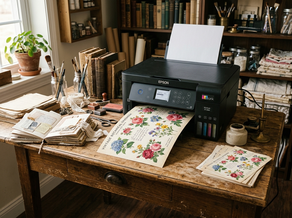
A coherent collection does not need a designer's colour theory. It needs one good source image and a disciplined selection.
Palettes are where many collections quietly fall apart. Each new element is chosen on its own — a paper here, a tag there — and by the time the set is finished, the colours have drifted. The fix is simple: derive the palette from a single source, write it down, and check every new piece against it. A vintage scan is the ideal source, because it already contains the natural unevenness that makes old paper convincing.
## Step 1 — Choose the right scan
Pick an image with varied but related tones: an aged ledger with ink, a botanical plate with muted greens, a postcard with soft chromolithographic colour. Avoid images dominated by one saturated colour, and avoid very dark or very clean scans — they give you little to work with. The ideal source has a clear paper base, two or three mid-tones and one accent.
## Step 2 — Find the paper base first
Before sampling any "colour", sample the paper itself. That tone — cream, oatmeal, pale grey, warm buff — will be the largest area in your collection and the reference for every print. If your paper stock is warmer or cooler than the scan's base, adjust the files rather than fighting the paper later.
## Step 3 — Sample six to eight colours
Use the eyedropper in any image editor. Sample from mid-tones, not highlights or shadows: highlights are usually paper showing through, shadows are compressed and muddy. Aim for:
* **one base tone** (the paper);
* **two neutrals** (a soft grey-brown, a deeper charcoal or sepia);
* **two supporting colours** (muted green, dusty blue, faded rose);
* **one accent** (rust, oxblood, antique gold).
* **Base (60–70%):** #f1e8d6 (Aged paper cream)
* **Neutral 1:** #d9cbb2 (Warm stone)
* **Neutral 2:** #8c8069 (Sepia / Deep charcoal)
* **Support 1:** #8a9a7b (Muted sage)
* **Support 2:** #7c8a94 (Dusty slate blue)
* **Accent (5–10%):** #9a3f2d (Vintage rust / Oxblood)
<div style="background:#d9cbb2"><span>neutral</span></div>
<div style="background:#8c8069"><span>neutral</span></div>
<div style="background:#8a9a7b"><span>support</span></div>
<div style="background:#7c8a94"><span>support</span></div>
<div style="background:#9a3f2d"><span>accent</span></div>
</div>
## Step 4 — Assign proportions
A practical rule for paper collections: roughly 60–70% base tones, 20–30% supporting colours, 5–10% accent. The exact ratio matters less than the discipline. If every page uses the accent at full strength, nothing stands out; if nothing uses it, the collection feels flat.
## Step 5 — Test in print, not on screen
Screens are backlit and optimistic. Print a swatch strip on the actual paper you will use, in the actual printer mode, and compare it to the scan in daylight. Expect a shift: matte paper mutes saturation, warm stock warms everything, ink limits compress dark tones. Adjust the files slightly — usually a small lift in brightness and a slight reduction in saturation — rather than chasing an exact screen match.
> **Write the palette down:** Record the hex or RGB values, the paper stock and the printer settings alongside the collection files. Six months later, that note is the difference between a consistent second release and a set that no longer matches.
## Step 6 — Apply it across the collection
Use the palette as a decision filter:
* **Backgrounds:** base and light neutrals, with texture doing the work;
* **Midground elements:** supporting colours at low saturation;
* **Focal pieces:** the accent, used sparingly;
* **Typography:** deep neutral rather than pure black;
* **Tags and labels:** base tones with accent details.
Repeat two or three signature motifs across the elements at different scales — the same discipline that makes a collection feel designed rather than assembled. For the vocabulary of collection consistency, see our [guide to cohesive collections](/blog/cohesive-collection-vocabulary/); for the production side, [building a cohesive kit](/blog/build-cohesive-junk-journal-kit/).
## Common mistakes
* **Sampling too many colours:** a palette of twelve is not a palette, it is a paint box;
* **Ignoring the paper base:** the stock is part of the palette;
* **Judging on screen:** print is the only test that matters;
* **Using the accent everywhere:** scarcity is what makes an accent work;
* **Not documenting:** future you will not remember which cream it was.
One scan, six swatches, one printed test — and a collection that looks like it was designed on purpose. That is the whole method, and it scales from a single tag to a full seasonal release.
---
*Related: <a href="/blog/cohesive-collection-vocabulary/">cohesive collection vocabulary</a> · <a href="/blog/build-cohesive-junk-journal-kit/">building a cohesive kit</a> · <a href="/blog/paper-weight-calliper/">choosing paper stock</a>.*