Printer Profiles: Settings That Preserve Detail
By Ephemera Crafts Atelier
•
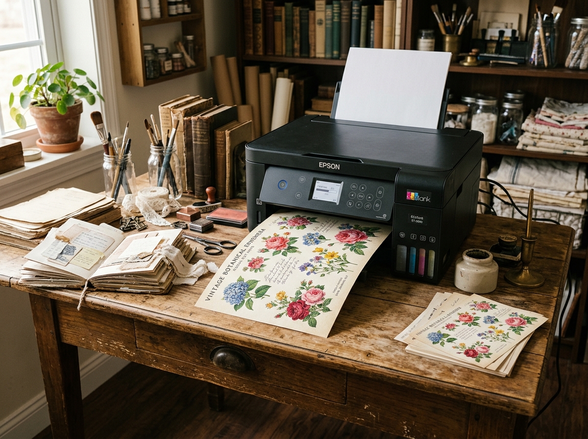
Most print-quality problems are three checkboxes away from being solved.
Printer drivers are designed for office documents, not for archival-looking ephemera. Their defaults prioritise speed and ink economy, which is the opposite of what a journal page needs. The good news: you do not have to understand colour science to get good prints. Five settings do most of the work, and once you find the combination that suits your printer and paper, you can save it as a preset and stop thinking about it.
## 1. Paper type — the setting that changes everything
Paper type tells the printer how much ink to lay down and how fast to dry it. The same file printed as "Plain paper" and as "Matte photo paper" can look dramatically different: plain-paper mode uses less ink and dries fast; matte-photo mode uses more ink, slower passes and finer dot placement.
Match the setting to the actual stock, even if the label is imperfect:
* **Thin matte text paper** → plain or lightweight matte;
* **Matte presentation paper** → matte photo paper;
* **Cardstock** → heavy matte / cardstock, if available;
* **Vellum** → the closest "transparency" or specialty setting your printer offers.
## 2. Quality mode — where the detail lives
Draft mode is for proofs, never for final pages. "Normal" is acceptable for text-only pages; "High" or "Best" activates the printer's finest dot patterns and slower passes. On many inkjets, the difference between normal and best is most visible in fine lines, small type and gradients — exactly the elements of vintage ephemera.
The cost is time and ink, not quality of the paper. For a journal page that will be handled for years, best mode is usually worth it; for test prints, draft is fine.
## 3. Ink density and drying
Some drivers expose ink density or drying time. If your prints look wet, smudge easily or bleed into the paper, reduce density slightly or increase drying time between passes. If colours look washed out, increase density. Make one change at a time and keep a test sheet for comparison — otherwise you will chase your own adjustments.
> **Test sheet:** Create a one-page test file with colour patches, a gradient, fine lines, small text and a photo. Print it whenever you change paper or ink. Compare against the previous test under daylight, not office lighting. It is the cheapest quality-control tool in the studio.
## 4. Colour management — avoid double correction
Colour can be managed by the application or by the printer, but not both. Two common problems:
* **Double profiling** — the editing app converts colours and the printer converts them again, producing dull or shifted output;
* **Wrong working space** — an image prepared in a wide colour space printed through a driver expecting sRGB can look muddy.
The safe default for home printers: let the printer manage colour, keep the document in sRGB, and avoid additional "vivid" or "photo enhance" options unless you have tested them. If your driver offers a "printer manages colours" vs "application manages colours" choice, pick one and stay consistent.
## 5. Black ink and text sharpness
Many inkjets have more than one black: a dye black for photos and a pigment black for crisp text. Driver modes choose between them automatically, but paper type affects the choice. If small text looks grey or fuzzy, try a paper setting closer to plain paper, or enable "black text enhancement" if available. Conversely, photo-heavy pages may look better with a photo-black setting, even if text is slightly softer.
## Save a preset, write it down
Once you find the combination for a paper, save it as a named preset in the driver ("Matte 32lb — best", "Cardstock 65lb — high"). Then record it in a note with the paper brand. Printers, drivers and papers change; a written record turns a lucky result into a repeatable process.
| Goal | Paper type | Quality | Notes |
| :--- | :--- | :--- | :--- |
| Journal pages | Matte photo / presentation | High | Test duplex offset separately |
| Pockets and tags | Cardstock / heavy matte | High | Rear feed, one sheet at a time |
| Test prints | Plain | Draft/Normal | Check layout, not colour |
| Vellum overlays | Specialty / transparency | High | Allow extra drying time |
None of this is about chasing perfect colour. It is about removing the accidental variables so that what you designed is what you get — and so that the tenth copy looks like the first.
---
*Next in the series: <a href="/blog/printing-cardstock-vellum-toned/">printing on cardstock, vellum and toned paper</a> · <a href="/blog/print-quality-control/">print quality control</a> · <a href="/blog/duplex-registration-printing/">duplex registration</a>.*